Monday, 29 November 2010

Well Cycled Ltd : Logo prototypes


Well Cycled Ltd is a up and coming company aimed at men 25+ interested in cycling, mass sportives, cycling get aways and more, above are some prototypes of the logo I have come up with any comments on the colour difference or constructive crit appreciated !

Tuesday, 23 November 2010

The Factory Dance Academy - New Hoody Design

Here I have incorporated my original logo design, giving the hoody a lot more of a corporate bold look, inspiration taken from Northern Soul!

Monday, 26 April 2010

Amazing Editorial piece I came across!


An amazing Editorial design by Alberto Seveso on World Famous Surfer Kelly Slater, I found on Behance.net,such a eye catching piece with such an intricate illustrative style. When looking at some other pieces of Albertos work this sort of style flows throughout his portfolio. Brilliant !!

Monday, 22 March 2010

Design Against Fur Finals!


This is a recent piece design I worked on in corporation with a photographer for a campaign competition against fur in the fashion industry. The theme this year was rabbits! My idea was based around role reversal in the quotation 'wear your fur not his' which I feel is protraid quiet well in the final outcome. The piece is a parody to famous athena poster 'Le'efant' Spencer Rowell ( Man and Child) To replicate your love for animal yet so brutally you will wear them , taking a natural look and idea wear your own not his.
I wanted the image to look as natural and untouched as possible and wanted to present it like it was an advertisement in a fashion magazine, being aimed towards a fashion market, so i kept the image full page with a light,simple, yet subtle sans serif typeface for the quote, drawing you into the image.

Some Funky Shop Graphics, Typography and illustraions, I snapped in London !!

Here I took a photograph of a funky illustrated bookcase I saw in 'Howies' shop on Carnaby street in London! I like the random chaotic bold style of these illustrations covering the bookcase!
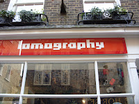

'Lomography' a wacky little phorography, film based shop! Not a very good image above but you get the jist of the funky pixelated, retro looking typeface they use for their logo!


Quirky little shop illustrative style graphics and typography used for window graphics and signage!

Converse Branding Signage Bold, instant advertising appealing to a london shopping market, used nicely simplisticly and small shop enterance!


'Size?' A Funky little Shoe Store using a typical sans-serif typeface 'Helvetica' making the shop have impact and a fresh, modern look that drew me in!


A few funky illustrative window and signage graphics I came across in Carnaby Street in a few urban, quint little shops!


'Ollie & Nic' Jewelry and habadashery Shop logo.

Design competition Winners!

YCN Award Winner 2009


I initially looked at this award winning piece by designer Paullet Sahota as I also completed and entered a design for this Kleenex packaging design brief. Through looking at this, I really liked this simple illustrative design for Kleenex pocket packs and liked the artists idea / concept behind the designs.

"My thoughts for Kleennex Packaging were to create a design that would be colourful, uplifting and a bit quirky. The butterfly design represents freedom and beauty, and I noticed a lot of young women have butterfly tattoos and/or wear butterfly designed jewellery. The ladybird design idea was influenced by children's book illustration. I thought that the insects can reflect the environment and even though they may not be stereotypically cute animals such as puppies, they can still reflect the beauty of nature."


Design competition Winners!

D&AD 2009 Competition Winner

Coffee Heroes -Graphic Design / Point of Sale

These creative little urban designs for a small gourmet coffee house in the trendiest area of Berlin, caught my eye when looking through the D&AD previous award winners. They aim at an alternative audience to go against the regs and to stand out from the competition. Berlin being the mecca of street art this set of designs are very apt and adapt to the culture well, with a series of stencils, printing the faces of cool, alternative heroes, like Muhammed Ali, Obama and Che Guevara so you can now in a creative way of thinking not only look at your idol but drink them!

Design competition Winners!

Northern Design Competition

Winner 2008: Sam McCluskey - Leeds Metrpolitan University
Entry name: Postcards for an English Summer

These quirky little postcards caught my eye straight away when looking through previous winners of Northern Design Competition. They portray the typical british weather brilliantly in a witty, fresh way! I like the medium the designer has used to make the cards look like they have been through a print press, fresh put slightly pop arty!

Winner 2009: Kerry Venus- Lincoln School of Art & Design
Entry name: Handmade Manifesto

Students description of work: "The Handmade Manifesto is a policy I wrote about how all designers should turn off their computers and get back to doing their work by hand.


When first looking at ''Handmade Manifesto'' it looked different and interesting then looking more into the work and reading the description i loved the concept and idea behind this piece of work a policy wrote by the designer about how all designers should turn off their computers and get back to doing their work by hand! brilliant little policy and lovely little way of showing this having all the design and type handdrawn / written onto hands!


Monday, 11 January 2010

SUPER HAPPY TIMES & SUPERMEGAVIOLENCE ILLUSTRATIONS


Inspirational Illustrations I came across on ffffound!.com and also Benhance.net. I liked the really quirky illustrative style that is used, the handdrawn fine liner, cut out look that they have, the bottom two cut out style illustrations are name 'SuperHappyTimes' and the above is another poster illustration from the same designer called 'SuperMegaViolence' on the same theme.

Tuesday, 5 January 2010

The HVD Comic Serif Pro Project:


So many designers hate Comic Sans, to be fair it is ugly and the majority of us think people who don't know design are overusing this funny little friendly font, which is nearly every time out of place. However type designer Hannes von Döhren created a free alternative to Comic Sans. The difference is this typeface has serifs and a much damn cooler look. The big success of the HVD Comic Serif pushed Von Döhren to create a Pro Version with an eastern, central and Western European language support.

“The HVD Comic Serif should spread all over and make the world a little bit better.”
says Hannes.

I found this funky little typeface on benhance.net and despite being a hater of comic sans do actually really like this type face as it is quirky and cool, and fits in a lot better with recent design as you can see in the images above.